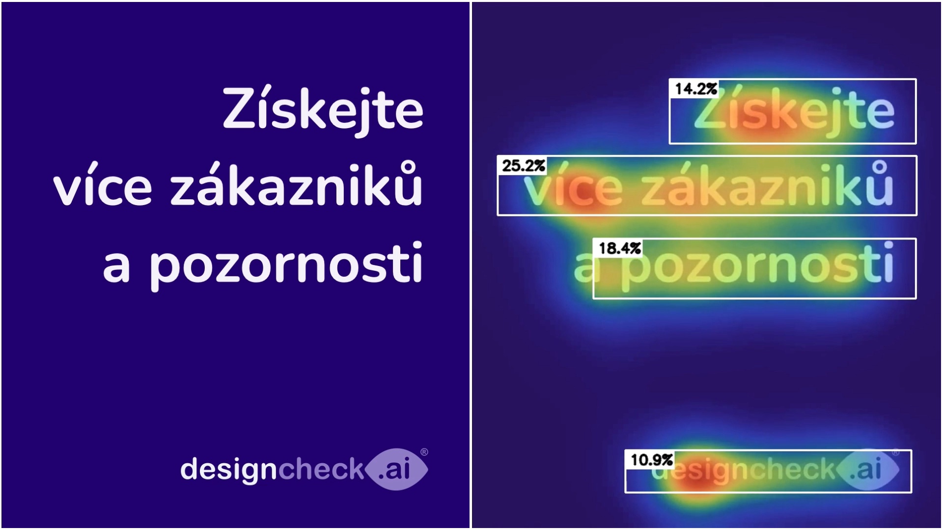
Sharing learnings with you

Below, you will find our most recent posts on the topics of efficient and effective communication, artificial intelligence and much more.

Design hierarchy and reader’s flow

MESSAGE DELIVERED! Have a nice day,In today’s episode, we’re going to look at the design hiearchy, that is, how good design readability can deliver key information to consumers in a clear and fast way. Why evaluate the design “readability”? Reading speed is important because in most communication touch-points the consumer or shopper gives us minimal time, whether we are in a physical or online environment. If we have 1-2 seconds in a traditional retail or e-commerce environment to grab the initial attention, we have another 2-3 seconds to deliver the key message. And the more complexly we put together and offer the information to the recipient, the more at risk they are of not reading it to the end and

Optimize your video or digital signage

Are you working with digital signage, animated banners or video? Are you looking for opportunities to optimize graphics for attention and message quality? With Designcheck.ai, we can now analyse not only static graphic design but video material. And I was surprised myself what new opportunities can be discovered this way. 😉 For example, the reader’s flow in a video is not always the same as in a static graphics and these differences we sometimes miss. Also, attention span can be increased by better variation of graphical elements. If you’re interested in learning more, we’re here to help!

How to deliver main message without getting lost in the ballast

Good day everyone, In the next episodes of Learning Designcheck.ai, we’ll focus on the art of communicating the essentials in marketing communications. Traditionally, we focus on the areas we most often recommend improving when evaluating marketing materials. This time, we’ll look at the core message. We often find multiple messages on marketing materials – in visual or text form. The number of these messages is often influenced by the fact that there are several departments working on it, often in good faith, with different objectives. And having clear objectives is good, but how many can our customers pick up on? Shoppers usually take in a minimum of information Our brains prefer to operate on autopilot and therefore love simplicity (more

There is more than beauty in simplicity!

Hello and have a nice new year everyone 🍀✌️ Last week I was reading through the results of research that looked at the key elements of packaging design in the retail environment in terms of primary shelf display. One of the key factors influencing grabbing the initial attention of customers was the simplicity of the design itself. And the existence of contrast and shapes was defined as an absolutely essential feature of the packaging. We focused on the importance of contrast in relation to attention in the last episode, in today’s episode we will focus on simplicity, which can bring not only beauty to our marketing materials, but more importantly, initial customer attention leading to interest and ideally purchase of

How to work with contrast to attract attention

Have a good day, everybody, In today’s episode, we’re going to look at one of the areas of design that largely determines whether our marketing communications get people’s attention. It’s also the area where we most often find opportunities to improve designs in the Designcheck.ai reviews. Let’s start with a little theory from the field of neuromarketing. Contrast is already important at the level of subconscious decision making Where we shift our attention in the next second is decided by our brain at a subconscious level. The subconscious mind responds to the stimuli provided by our senses – sight by sight, sound by sound, smell by smell, etc… If we focus on an image, the vast majority of it (99%)